ORC Week 3 - Let the demo begin!
WEEK 3 - ONE ROOM CHALLENGE
I can’t tell you how excited I am for the demo to begin in our kitchen! Preparing for this renovation has genuinely tested our patience. But, I’m happy to report that we’re doing OK and pushing through to make this reno happen quickly and efficiently. This week we’re focusing on finalizing design plans so we can order our finishes as soon as possible.
It’s been a challenge keeping our overall concept under wraps, especially since we’re moving in a different direction than the old kitchen. However, this design feels more like. “us” and incorporates a modern tone while still feeling comfortable.
MODERN KITCHEN DESIGN PLANS
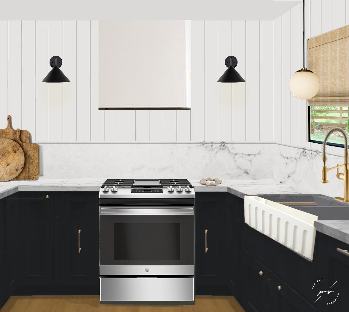
The main goal of the space was to make it feel intentional. I wanted to escape the classic all-white kitchen and bring depth through a deeper cabinet tone. Kevin and I agreed that we wanted a kitchen that would POP, and the cabinet color does that! I love how the shade pairs against our new LVP flooring, and I think the combination of the two will add the warmth we’ve been missing.
Speaking of cabinets, we had a few last-minute changes and decided to remove the wall cabinets flanking the kitchen sink. Unfortunately, based on our tight timeline, we couldn’t get exactly what we wanted in the allotted time. So, I reconfigured the design, and we both agreed it improved the sight lines and overall cohesiveness of the kitchen. It also has added to the clean, modern feel that we desired.
I’ve never designed a kitchen before, so this has been a huge learning process and made me hone my math skills - which are terrible!
While the overall specs of the kitchen will remain the same, we will be adding a few new additions to define each space. We had our contractor add electrical on either side of our range hood and reconfigure the recessed light to accommodate a drop pendant over the sink. I had been initially eyeing this alabaster pendant light from CB2, but after spying on the backorder date (May 23’), I had to move on to other options. With this light, we’ll stick with the same round shade but go with the matte or frosted glass option.
Other finishes we’ve selected include a fluted ceramic farmhouse sink (she’s a beauty) and several black stainless appliances. If you follow along on Instagram (@the_pacificstandard), you’ll have seen the fantastic deal we scored on our Café appliance fridge!
*Forgive my quick photoshop skills!
I think the biggest challenge has been flexing with the challenges and finding other options. So far, many of these changes have benefitted the design, and I hope they continue to do so! In next week’s post, I’ll share an update on the kitchen progress and some of the final finishes.
This post contains affiliate links. If you use these links to buy something we may earn a commission. Thank you for your support!


