First Look: Simple Redesign Projects for your Living Space
Every now and again I get the itch to rearrange the rooms within my home. It’s something I’ve done for years, and can really do wonders to refresh the overall feeling of your space. Since moving, we hadn’t done a whole lot with our living room. It’s a space within our home that we spend most of our time in, and even more so since we adopted Sampson. I shared our concept and overall styling that we envisioned here, a space that aligned with a modern, eclectic aesthetic, think classic hues paired with more bohemian rattan accents. The project is something we’re looking to do in phases.
Overall, what our new living space was lacking was proper storage and a functional seating arrangement, aka, our first task. As we begin to check things off the list we’ll start to shop for additional items, like decor, lighting, and finally changing out outdated artwork! Hope you’ll enjoy following along with this process.
Lack of Storage
We were lucky enough to invest in a few key pieces early on that have made their way from the previous places we have lived, but still lacked proper storage. We were thrilled to partner with Apt2B, to solve our storage dilemma and now have a functional and stylish addition to hold all our knick-knacks. Enter the Murtaugh Buffet Console, a sleek, solid wood cabinet that literally fits in perfectly with our existing decor! Aside from its exterior appearance, the one thing that caught our eye was the narrow dimensions. It fit snug against the wall without appearing bulky or complicating sightlines.
To keep things looking just as sleek inside as they are outside, we picked up six rattan baskets to hold lose items that didn’t have a spot in our kitchen or side closet. They fit perfectly within the credenza and help us stay on top of our organization.
Seating for Guests
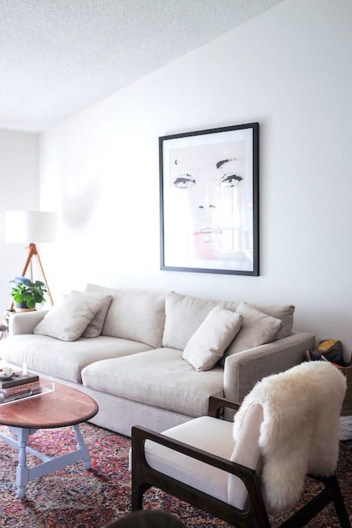
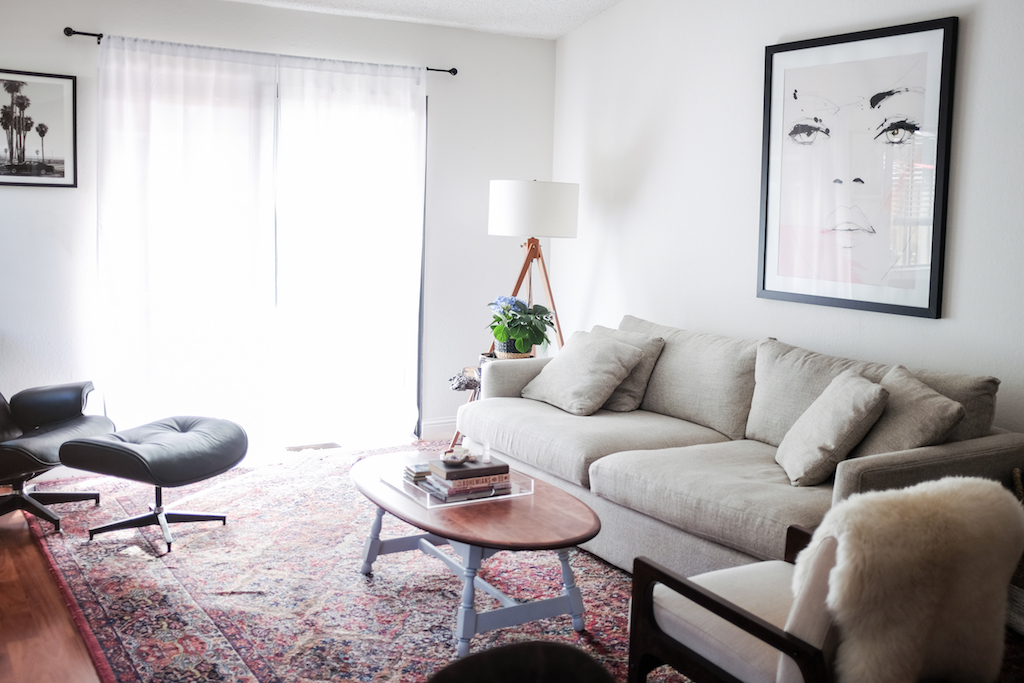
Due to the narrow dimensions of our home, the living space reflects a challenge when it comes to arranging furniture. Too many pieces clutter the walkway, while too little furniture doesn’t provide enough seating for guests. When it came time to invest in a sofa we went with a deep couch in a neutral color so that it wouldn’t take away from other pieces. The Lounge II 93" Sofa from Crate and Barrel anchors the space and is the most comfortable piece of furniture we own. We often joke about it being the sleeper sofa because it's so easy to nap on!
In terms of additional seating we ended up moving a chair from our spare bedroom to sit adjacent to the sofa which creates a conversation area. The coffee table is an original mid-century piece from my grandparents that we we have had in all of our places together. I think having vintage or older pieces to round out a space is essential to the overall vibe. It helps things look like they belong and overall create a homier feeling.
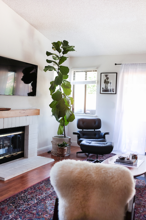
For extra seating we also have our Eames look-a-like in the corner. This is one piece that we quickly were obsessed with and adds a masculine feel, not to mention its the perfect place to curl up with a book.
Rounding out the Decor
So what’s next? Both Kev and I agree that we’re not as close to the artwork we carried from our previous spaces. We’re looking for a more cohesive feel with pieces that ring true to where were at in our lives. For example, we’re looking to add more personal photographs from our travels or of family and friends, after all it is a living room! To cut cost we’ll upcycle several of the frames and invest in custom mattes to achieve a higher-end look. I think we’ll hang on to the Corvette artwork from Minted, as its found a home in the corner and fits in quite well.
It’s safe to say our concert poster will stay but, more than likely will also get mattes and possibly move to the hallway or office.I hope you have enjoyed this mini redesign and continue to come back to read the next installment of updates!
*Thank you to Apt2B for solving my storage dilemma and helping get our space into shape for Fall!


