Bringing in the New with Safavieh
This post was written in partnership with Safavieh. All opinions expressed here are 100% my own.
One great thing that came out of our recent remodel was the perspective we gained. Knowing we had to pack up our home for the kitchen renovation gave us a chance to rework our living room arrangement. Most of what was done with this space was a simple swap in orientation. It gave our entry/living room new life and a completely new flow to our home.
How to create conversation areas
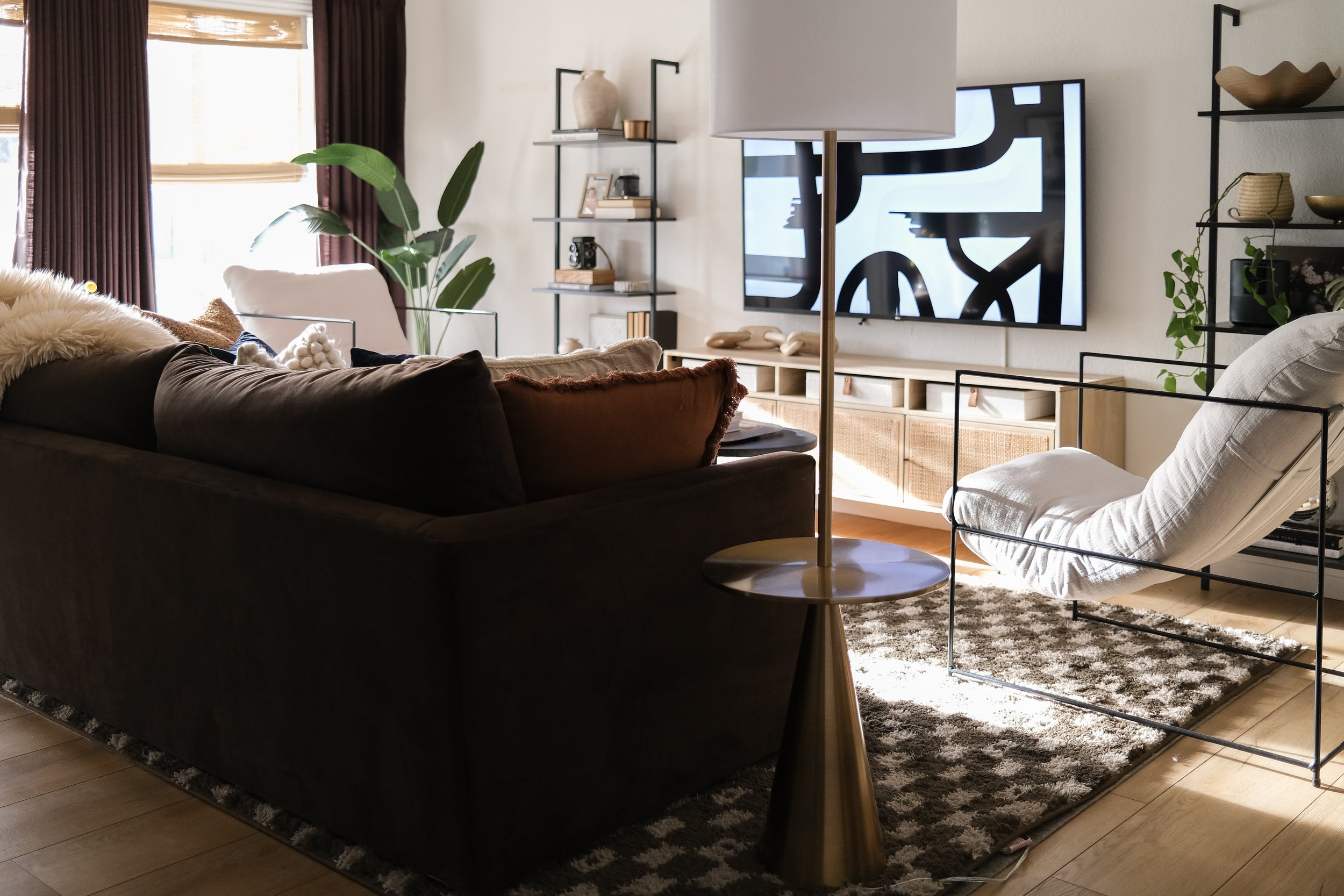
Much of living in a small home is making changes to suit your space. Previously we had most of our furniture on the wall, which felt like the obvious choice. In reality, it wasn’t practical and prevented us from getting the most out of our space in terms of storage and seating. Taking the heaviest piece of furniture off the wall helped us create a flow that worked with the room’s length. We then flanked the sofa with two new accent chairs from Safavieh.
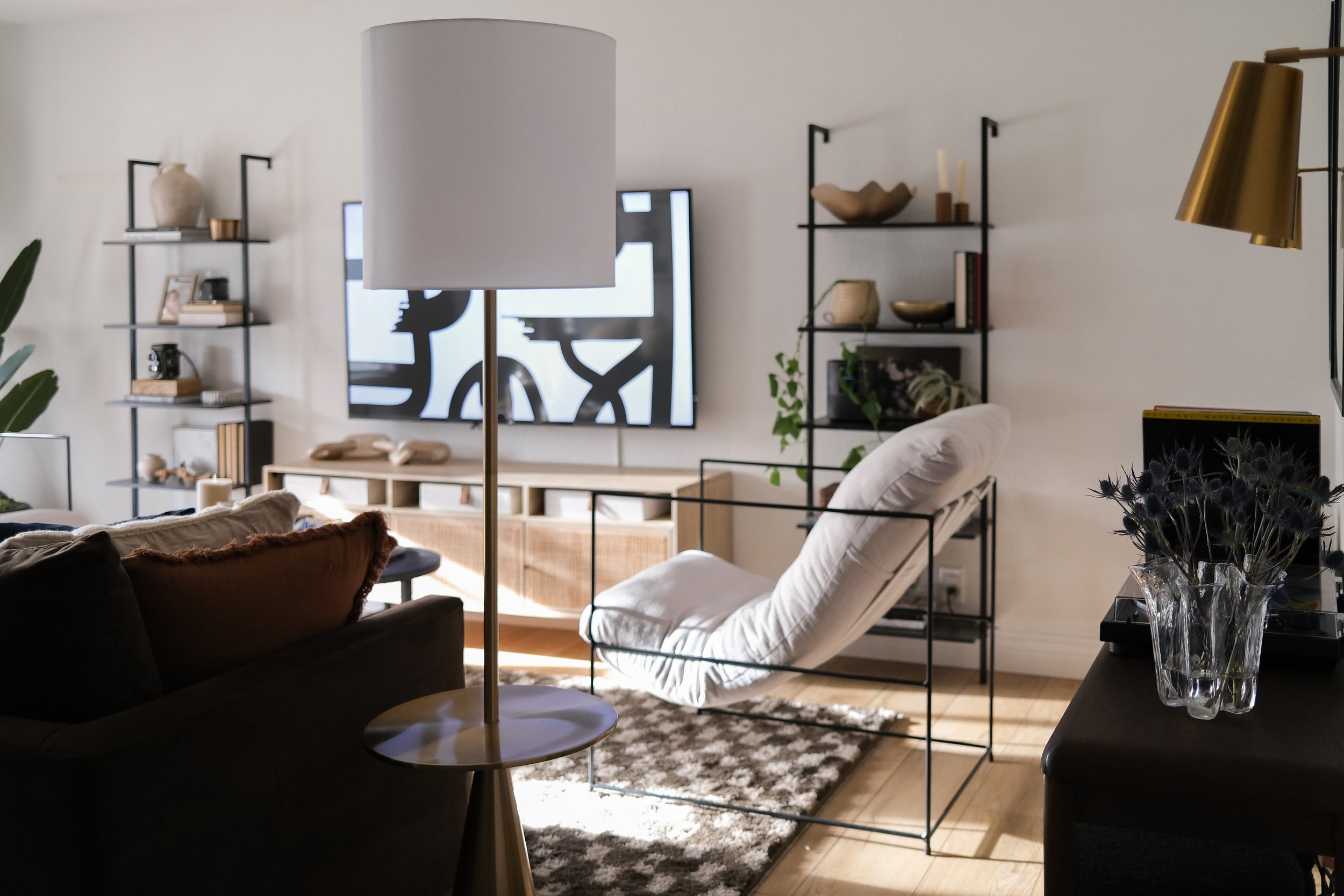
I loved the modern lines of the Portland armchair from Safavieh. The sturdy frame and slim lines make the room feel much more spacious, even though the chairs are a good size. The chairs are incredibly comfortable. The cushion sling contours the body and creates a very luxurious seat. Two friends who recently have come over raved about them!
Utilizing furniture of different scales and arranging them side-by-side allows open conversation in various ways. Likewise, the two chairs facing each other further encourage the flow of interaction and comfort.
Finding Balance with Large-Scale Furniture
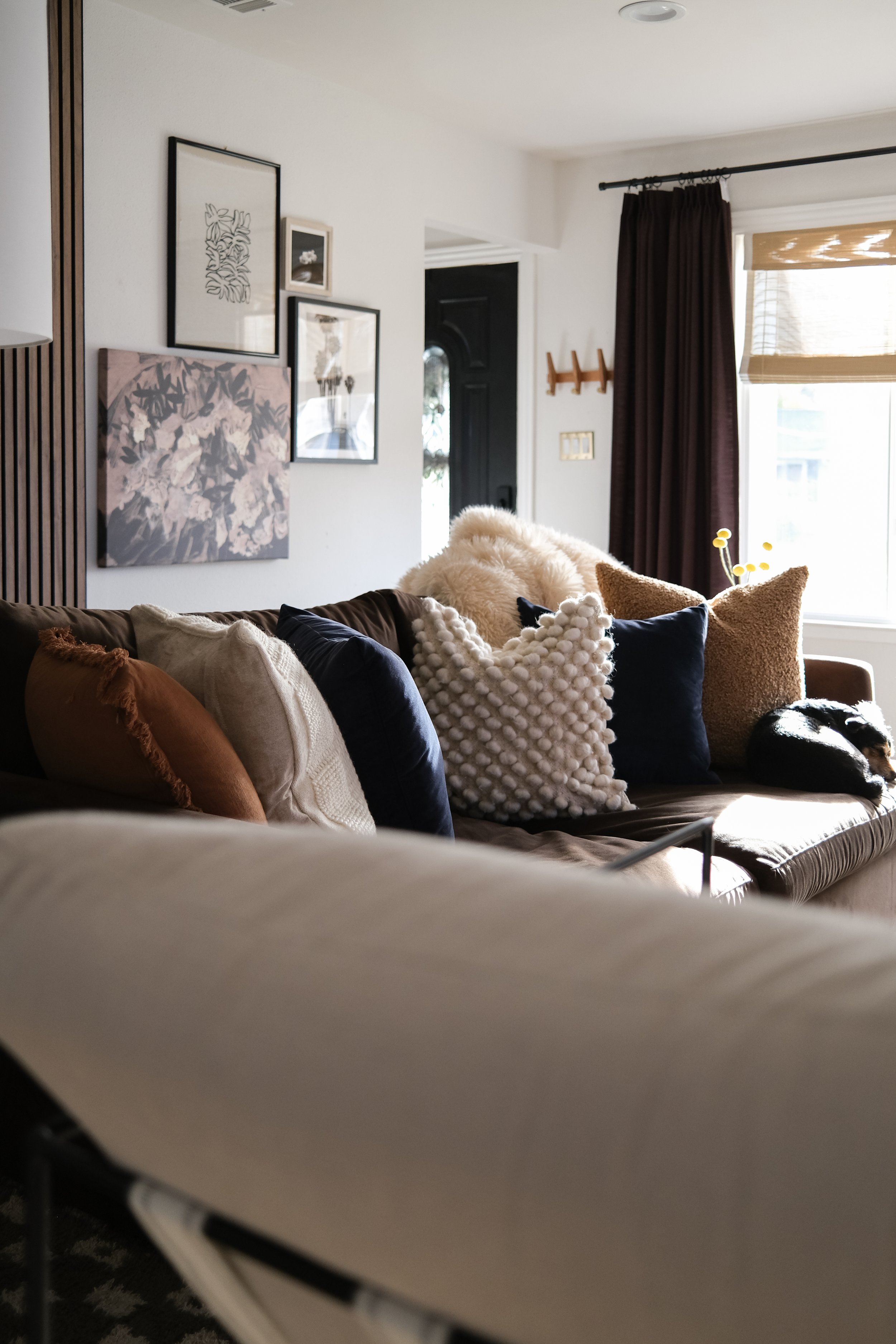
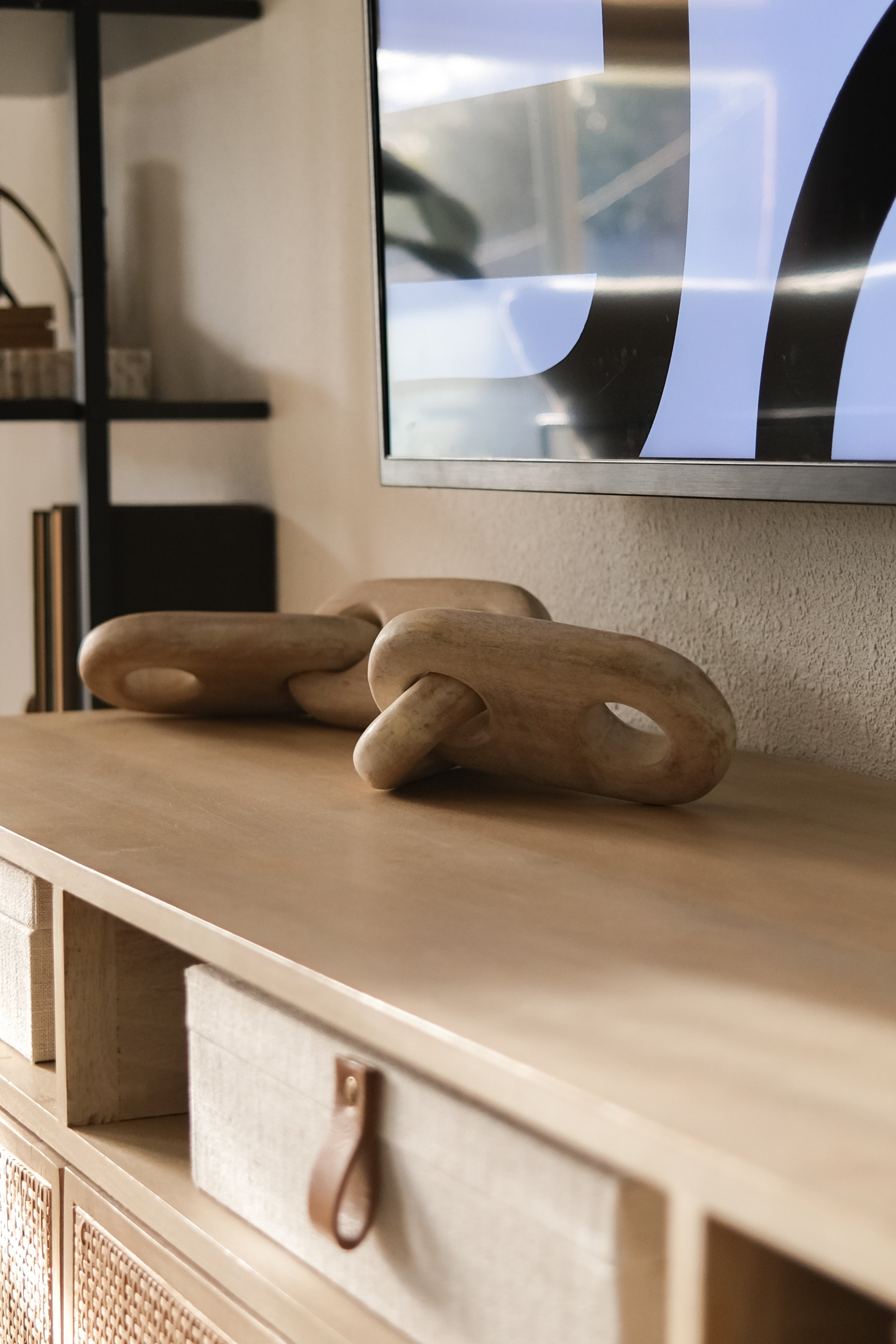
We brought in a new deep lounge couch in a mid-tone velvet brown that is both pet and kid-friendly. We couldn’t purchase a new white/cream couch every few years - they aren’t practical for our family. I love the contrast between a darker couch and lighter walls. It helps modernize our decor and feels like the anchor of the room. We flanked the TV with two ladder bookcases that fit perfectly aside from our rattan media console.
We placed our repurposed wood console along the back wall where we keep our record player and vinyl stand. For extra seating, we stashed two boucle ottomans underneath. Above, we placed two modern brass wall sconces from Safavieh. Aside from adding additional task lighting, it anchors the accent table and gives it purpose - without feeling like it’s merely floating in the room.
Shop the post
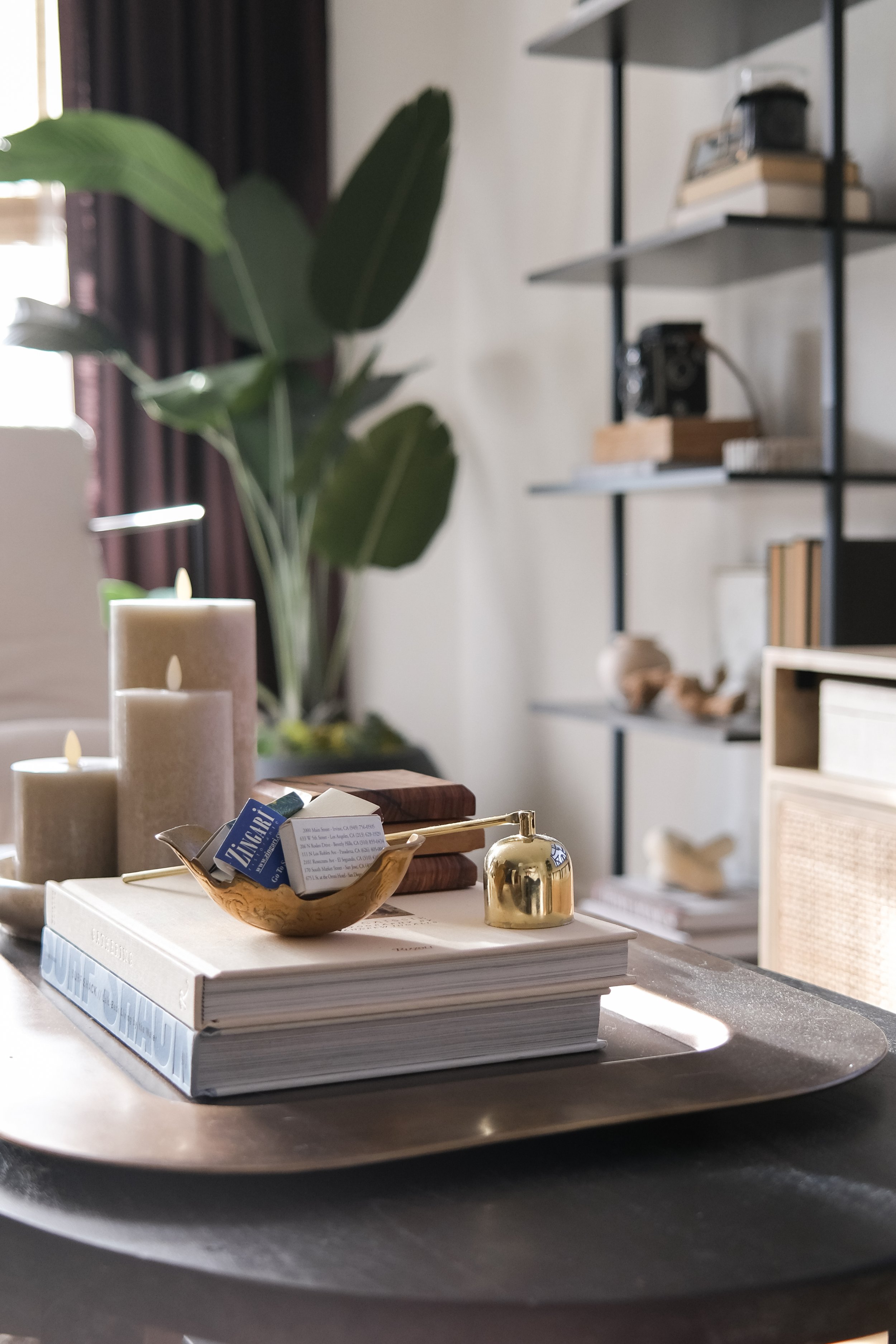
Safavieh Portland Armchair | Leonardo Wall Sconces | Check Rug | Coffee Table | Velvet Couch | Surf Coffee Table Book | Coffee Table Tray | Media Console | Storage Boxes | Large Wood Chain | Ladder Bookcase | Floor Lamp | Round Planter | Faux Palm Tree
living room Phase 2 - What’s next?
I firmly believe in completing a design project in phases, especially those requiring time and patience. Since most of my design plans involve time, they often are broken up into 2-phases. For this project, we have the design of the space nailed down. To add more depth and detail to the room, I plan to add wall molding to the TV and side wall. It’s a somewhat simple touch that creates interest that will tie in other areas of our home that have this treatment.
This post contains affiliate links. If you use these links to buy something we may earn a commission. Thank you for your support!

